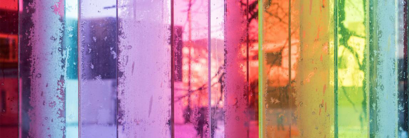
Hotel in Color

Share

Pantone_Hotel_1jpg

Impeccably designed by Michel Penneman and Oliver Hannaert, the Pant one Hotel, Brussels showcases the color of emotion with a distinctive hue on each colorous guest floor.  From vivid to subdued, for business or leisure, the unique boutique hotel perfectly suits your savvy palette and colorful imagination.

Welcome to the center of the color universe.

Read more…

Owatonna Hospital Reflection Center: Colored glass creates soothing, restful environment for healing

Share

In the Reflection Room of the Owatonna Hospital, patients find a quiet refuge amid the hustle and bustle of a busy hospital. The architect states that “the colored glass, combined with other calming features, makes this an ideal place to celebrate a birth, pray with family members, contemplate next steps, make some of life’s biggest decisions, find a moment of tranquility or grieve a loss.” The tinted windows offer beautiful views of the Healing Garden and the rolling hills beyond, but also provide a private place for visitors to connect more fully with their spiritual self, reinforcing the hospital’s commitment to “treating the whole person-mind, body, and spirit.”

Project Category: Interior

Project Name: Owatonna Hospital Reflection Center

Location: Owatonna, Minnesota

Glass Laminator: Viracon

Photographer Credit: Courtesy Owatonna Hospital

Architect: HGA Architects

Address: 701 Washington Avenue North Minneapolis, Minnesota, USA 55401

Phone: (612) 758-4000

Design Project Profile: Black Pearl

Share

Building Owner: Metropolitan Construction Company
Architectural Firm: Shin Takamatsu

On a motorway to Taiwan from the Taipei airport gleams a magnificent and sparkling jewel-like building, located in the center of a bustling new business park designed for information technology and biotechnology companies. Metropolitan Construction Company, who named the building “Black Pearl,” commissioned this project to be built not only as prime real estate but also as a landmark. Cross-shaped LED lights mounted at the intersection of each window sash create the effect of constellations of shining stars on the buildings exterior – set against a pristine black, subtly curved glass façade that corresponds to the “flowing” shape of the Keeloung River which winds in front of the building.

Black Pearl is surrounded by buildings with light colored panels and glazing, further highlighting the arresting black appearance of the building. Solutia’s black Saflex™ interlayers for glass were chosen to create the intrigue and mystique surrounding the building, which has been called a sparkling wonder in the night.

“We chose to explore ‘heaviness’ as the primary design theme. The heaviness is similar to what small jewelry possesses.  It intrigues people, encouraging the creation of a bond between them,” says Shin Takamatsu, architect for the Black Pearl project.

The glazing of Black Pearl was also designed to help withstand Taiwan’s occasional earthquakes and typhoons. While laminated glass may crack, it tends to stay within the frame, providing added safety during an earthquake or typhoon.   The Saflex protective interlayer in laminated glass helps glass fragments stay in place, protecting people from injuries resulting from wind-borne debris.

Windows can also be the weak link in the transmission of unwanted sound into a building. Just as a window lets in light, it can also transmit noise from sources such as airplanes, traffic, and heavy machinery. The Black Pearl architects also selected Saflex because it dampens the vibration of the glass, thus reducing transmitted sound.

Technically, a three-dimensional smooth façade was realized by dividing the building’s surface into 1598 areas and covering them with 799 patterned flat glass panels. To combat the sunny climate in Taiwan, Shin Takamatsu employed a special gray-film laminated glass (visible light transmittance rate: 0.44%, UV cut rate: 99%, reflectance value: 0.67), to reduce glare and improve office working conditions. By controlling direct sunlight, the glass reduces energy requirements for air-conditioning.

Effects of glazing color types on daylight quality, arousal and switch-on patterns for electric lights in a scaled office room

Share

In March 2010 a group of researchers from Quebec, Canada tested the visual quality and comfort of different types of window glazing in a typical office space. What they discovered may change the way architects think about window glazing in office buildings.

Based on an oral questionnaire, a written questionnaire, and ratings from the Karolinska Sleepiness Scale (KSS), the researchers compared the visual comfort, naturality, pleasantness, precision, and light level of blue, bronze and neutral glass experienced by each of the thirty-six participants. The results from each survey were combined and given an average score so that researchers could compare the three colors of window glazing.

They discovered that blue glazing actually increased the participants’ sleepiness, while bronze and neutral glazing had almost no effect on sleepiness level.

In terms of visual comfort, pleasantness, and light level, bronze glazing was preferred over both the blue and the neutral tinted glass. Participants also stated that the appearance and texture of objects in the room looked the most natural when viewed with bronze window glazing.

The participants’ tendency to switch on electric lighting did not show any significant results from one type of glazing to the other.

Overall, the bronze tint was collectively preferred by the participants and they found that it had the highest level of pleasantness and naturality. Based on this study, the architects and designers of future office buildings may want to consider bronze window glazing to increase the comfort and success of office employees.


Design Project Profile: Crèche Lauzin Daycare Center

Share

Crèche Lauzin Daycare Center, Paris, France

Architect: Shohreh Davar Panah – Sarre, Atelier Architectes
Laminator: Pilkington
Building Owner: City of Paris, Paris, France

We have all dreamt of a candy-coloured school at some point in our lives. Well, architect Shohreh Davar took this childhood dream as inspiration for the new decor of the crèche situated on rue Lauzin in the 19th district of Paris.  With a hint of imagination, a pinch of naughtiness and a wealth of creativity, she transformed the school facade into a brightly coloured sweet wrapper.

Sho Davar Panah, the architect in charge of the project, dabbled with a palette of eight colours to come up with a pattern of bright tones set out like fragments of barley sugar along the school wall. Each colour, whether apple green, violet, pink, azure blue or yellow, shines in the light of the next one.

Davar simply states, “The random patchwork of colours evokes a childlike fantasy of sweets!” We can’t argue with that.

The internal and external architectural environment of the crèche was crucial in the development of the senses of the children it looks after. The architects were keen to provide the children with bright colours and began by looking at the possibility of graffiti drawings.  They later opted for transparent glass with coloured inserts as this was the optimum solution for marrying colour with clarity and brightness. All of the shades chosen contribute to the well-being of the children and impart a lighter and more childlike feel on to the building and the district as a whole.

This colourful glass façade truly gives a fresh boost to the 1970s buildings and has updated the image of the 19th district of Paris wonderfully.

WOCA Project Profile: Yabany

Share

Designed by Architect Brunete Fraccoreli

Mixing glass and steel with natural fibers, Architect Brunete Fraccaroli created an unusual Japanese restaurant in the heart of São Paulo. The main concern of the client was to not loose the orient al style, while achieving a unique and original space.

While Brunete Fraccaroli makes use of many materials in her projects, her favorite material is Vanceva® colored laminated glass. “Right now Solutia’s products represent a great solution,” said Fraccaroli. “Glass is a material with many functions.  We can use to separate the environments, without losing the interactivity and gaining in space.  It is a lightweight material, noble and has characteristics of modernity.”

All of the windows in the project were made using Vanceva color interlayer for laminated glass, as well as the partitions and balcony railing. The lighting fixtures were custom designed for the project by the architect. To create a cosmopolitan atmosphere, the use of pink and orange in translucent glass, produced an unusual effect of dynamic illumination.

Entry #: 1061

Architect
Brunete Fraccaroli Arquitetura e Interiores
Rua Batataes, 460 – 4º andar – Jardim Paulista
São Paulo 01423-010
Brazil
P 55 11 3885-8309

Project Information
Name of Project: Yabany
Location: São Paulo
Glass Supplier: Santa Marina Vitrage
Glass Processor: Penha Vidros
Photographer Credit: Tuca Reines

Design Project Profile: Westin New York at Times Square

Share

Builder: Tishman Realty & Construction Co., Inc.
Architectural Firm: Arquitectonica
Laminator: Viracon
Glass Installer: Permasteelisa

Within walking distance to the world’s finest retail shops, dining establishments, and entertainment venues, the Westin New York at Times Square flawlessly marries architecture and art.  The trendy hotel creates a dramatic and vivacious entrance to Times Square, combining the best of style and design.

Miami’s acclaimed architectural firm, Arquitectonica, designed the Westin New York at Times Square with a stunning 45-story “prism” tower featuring 8,000 sheets of glass in ten colors, split by a 355-foot-long curving beam of light soaring above the New York City skyline. “At roof level, the arched light form projects beyond the physical bounds of the structure into the Times Square night,” says Laurinda Spear, FAIA, principal and co-founder of Arquitectonica. “The blending of glass, color and light reflects the spirit of Times Square.”

Numerous obstacles were overcome to bring the massive project to fruition.  The hotel was built on a 17,500-square foot locale on one of the busiest corners in midtown Manhattan. “This was a very challenging job from laminator’s perspective,” says Pam Ellis, customer service manager at Viracon, an industry leader in glass fabrication.  “It took 15 months to produce the glass, while the average is usually six to nine months,” said Ellis. “The glass shapes were unique – we had to create triangles and trapezoids as well as traditional rectangles. This required laying out laminates on the diagonal to achieve the required shapes. Along with the sheer number of glass configurations, the glass shapes added to the project complexity.”

A total of 180,000 square feet of glass went into the façade of the building with 34 different combinations of interlayers in various configurations. Solutia’s Vanceva® Design colored interlayers were laminated into the glazing used in the entire hotel façade of the building. Gold, copper, blue, green, violet, silver, white, and aqua were chosen from the Vanceva Design color line.

The project took over eight years and $322 million dollars to complete. The Westin is the largest groundup construction of a hotel in New York City in the past 17 years, according to industry resources. It remains an inspiration to the design community and truly represents an inspired use of color.

The Power of Glass and Colour

Share

Courtesy of jury member Andrew Moor

Glass forms a major part of the external skin and interior dividing walls of contemporary buildings. It is also used for balustrades, elevators, desks, and almost anything else that can be thought of.

It is not difficult to add colour to glass, as well as patterns, textures, gradations of tones, and other qualities, all of which add to the enormous versatility of the medium. This is a language that is available at a reasonable cost, and that can transform the character of a building – yet one that, surprisingly is not widely exploited.

Glass and colour are a powerful combination.   The use of colour as part of a building’s exterior has a powerful impact on the immediate surroundings. And when the glass is experienced from the interior, the internal space can be transformed.

Design Project Profile: Carrer Mestre Nicolau

Share

Maestro Nicolau, Barcelona, Spain

Courtesy of jury member Fermín Vázquez

Architect: Fermín Vázquez b720
Laminator: Cricursa Cridecor Vanceva 6.6 (www.cricursa.com)

When we completed the work on the office building at Carrer Mestre Nicolau number 19, I asked Rafael Vargas to create a portfolio of photographs that would serve as the basis for an exercise half way between recording and analysis, on the architectural sense and consequences of having used colour. Through the use of an architectural device that is simple in principle (a horizontal brise-soleil) but sophisticated in conception (range of colours, density of shades, arrangement of the bands) and precise in execution (a slender stainless steel section grips each strip of glass along its length and discrete clips fix it to the facade) we aimed to respond to our client’s commission: avoid the anonymity of the typical expensively refurbished office building.

The project consisted of transforming an administrative building between party walls, with significant structural problems, into an office building with all the flexibility and services expected of such construction.  The new façade identifies it as a contemporary corporative building. Colour is a tool used to incorporate it into its residential setting.  Each strip is an assembly of different coloured segments, such that, from the front the composition of this glass screen san finally be clearly seen; a juxtaposition of vertical, monochrome bands passing through successive gradations from red, to orange, to yellow, to pale green.

It is satisfying to think that our work has served as a pretext to enable us to think about color as a delicate resource in the hands of an architect. Without the confidence and trust of a client like Layetana it would have been impossible to carry out this project. Also, Circusa and Solutia, thanks to their exceptional technical expertise and their commitment to our architectural aims, enabled us to achieve the subtle transitions of colours we were seeking for the glazing of the facade. This strong urban signal provides solar protection for the offices that lay behind it as well.

THANK YOU!

Share

Thank you to everyone who submitted an entry to the 2012 World of Color Awards™! We received an astounding number of entries so far! Great job to everyone who entered, and don’t forget that the contest has been extended until April 15th, 2012. Let’s keep entering new projects!  Check out our Facebook Page for images.

Twitter Twitter   Flickr   Flickr
Facebook   Facebook   YouTube   YouTube
RSS   RSS    
Solutia

© 2011 Solutia Inc. All rights reserved. SOLUTIA AND RADIANCE LOGO, Vanceva® and World of Color Awards are trademarks of Solutia Inc. As used herein, ® denotes registered trademark status in the U.S. only.

Privacy Policy

E-Newsletter

Sign up for our e-newsletter to get future World of Color Awards updates.